03— Enterprise · Fintech · PaaS
CMB Private Cloud
A unified internal cloud platform for one of China's largest retail banks
Period2020
RoleLead UI/UX Designer
MarketInternal private-cloud platform
StatusDelivered · Internal enterprise platform
- Team
- Bank-side engineers, ops, and security stakeholders
- My scope
- Enterprise IA, operator workflows, interaction design, visual system, and handoff
- Constraints
- Dense technical data, long sessions, security requirements, and legacy workflows

Overview
Banking infrastructure people stare at the same screens for hours. The job here was to honour the complexity of the work while giving operators a calm, legible, and dependable interface to live inside.
The problem
CMB's internal teams managed the bank's private cloud through a scattered set of scripts, legacy dashboards, and undocumented operational knowledge. The fragmented workflow made system state harder to understand, increased the learning burden for new hires, and introduced risk as the cloud footprint expanded.
My approach
I led UX from competitive analysis through delivery. I translated highly technical internal tasks into operator workflows, built a shared design system, and delivered a unified console with three layers of contextual onboarding and a system-wide dark mode checked against WCAG contrast criteria.
Enterprise design decisions
Enterprise tone for internal bank users
Internal banking tools sit at the intersection of compliance, operations, and engineering. The visual language is restrained, the IA is unforgiving — every label, status, and alert had to read clearly for engineers, operators, security stakeholders, and new hires.
Accessibility as a non-negotiable
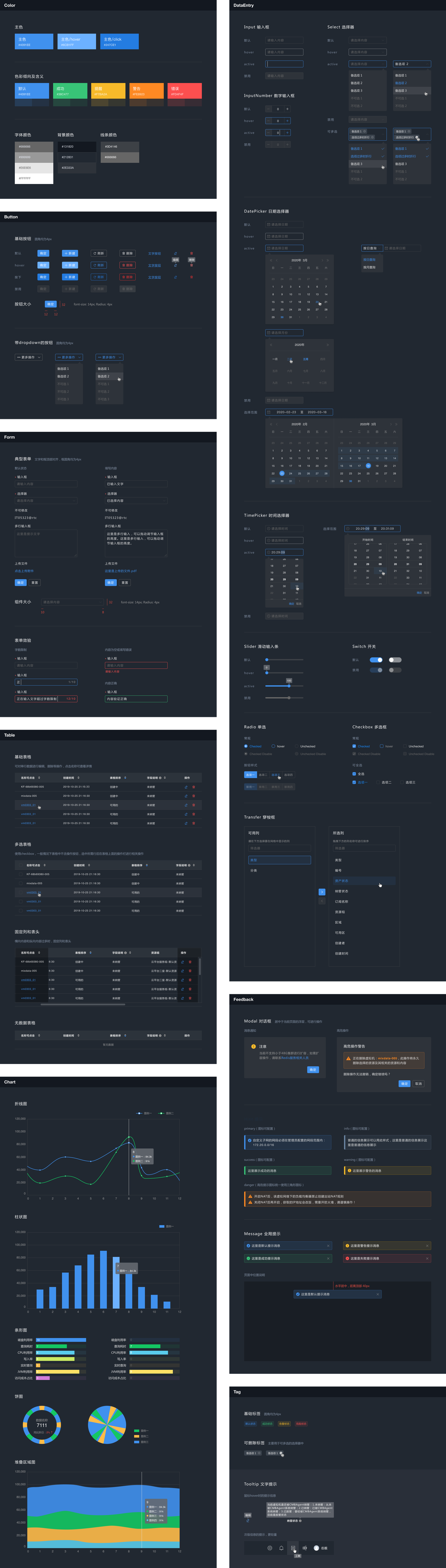
I did not treat dark mode as a colour inversion. I checked contrast against WCAG criteria, redefined semantic colours for alerts and data visualisations, and reviewed component states across both themes.
Foundation
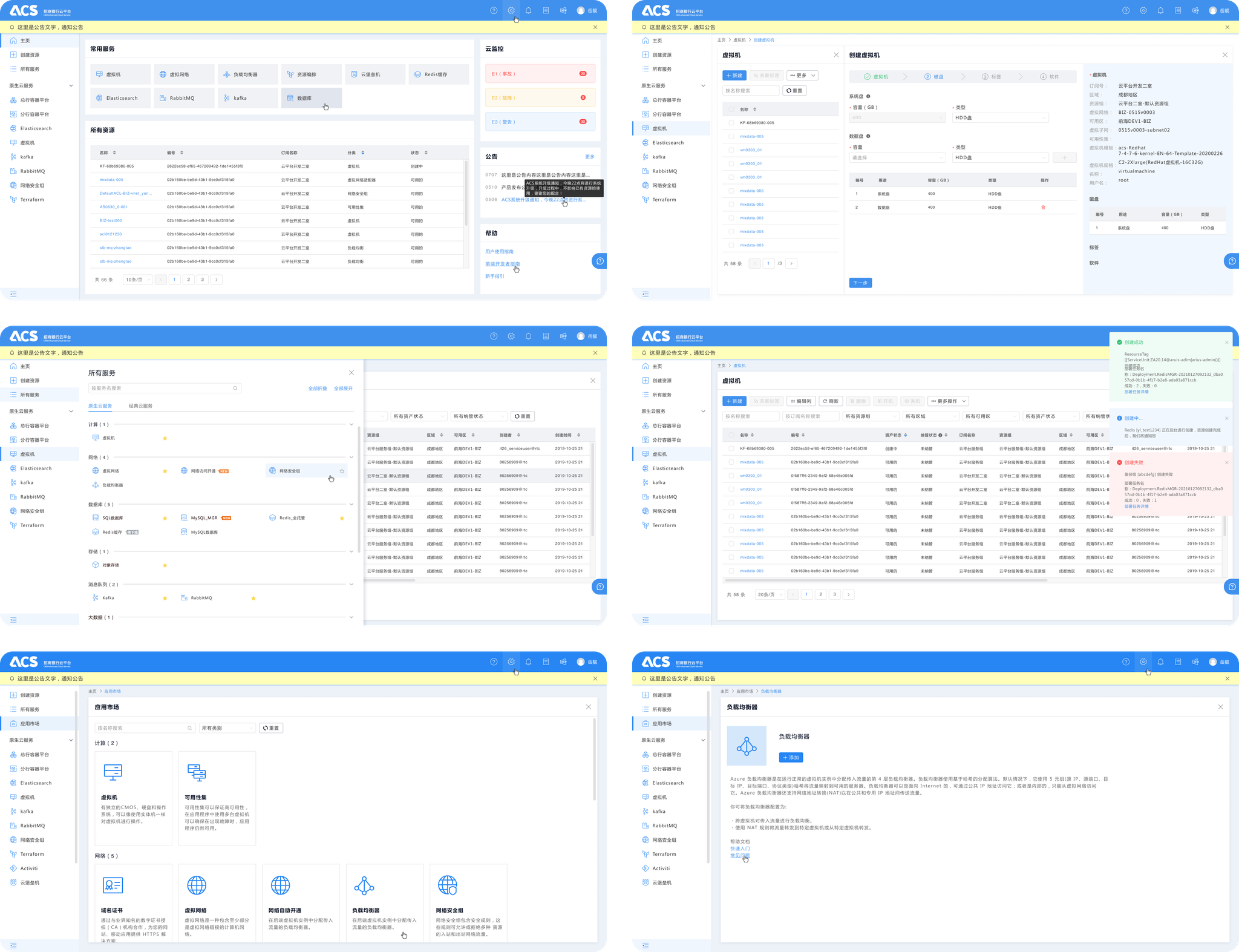
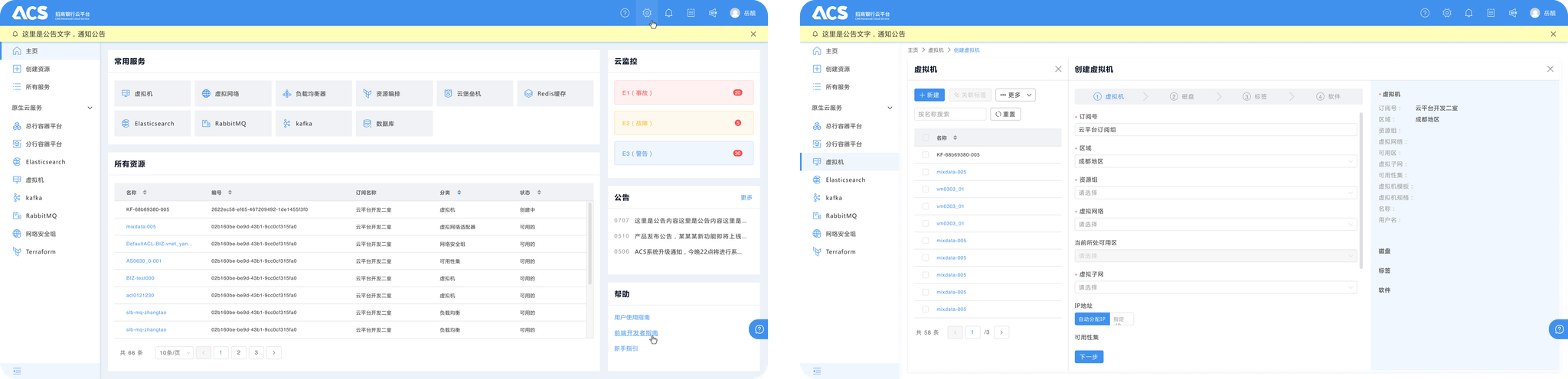
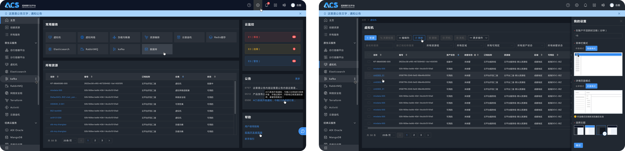
Unified Dashboard, Interactive Tables
Operators previously moved between scripts, legacy dashboards, and undocumented knowledge to understand system state. The unified dashboard brings status, alerts, and related actions into one surface while preserving the information density required for operations.
Tables were designed as working interfaces rather than static reports: an operator can identify an issue, inspect its context, and begin the relevant action without navigating to a separate tool.
Workflow
From detecting a problem to acting in context
I used one recurring operator task to organise the console: detect an abnormal state, understand its scope, inspect the affected resource, and begin the relevant action without losing context.
The dashboard establishes severity and system state; the interactive table preserves filters and exposes the affected resource; the detail layer keeps history, dependencies, and the next action together. This sequence became the information-architecture spine rather than treating each screen as a separate feature.
Detect
Prioritised status and alerts make abnormal conditions visible.
Understand
Context, dependencies, and history clarify the affected scope.
Act
Related actions begin from the same working context instead of another tool.
Onboarding
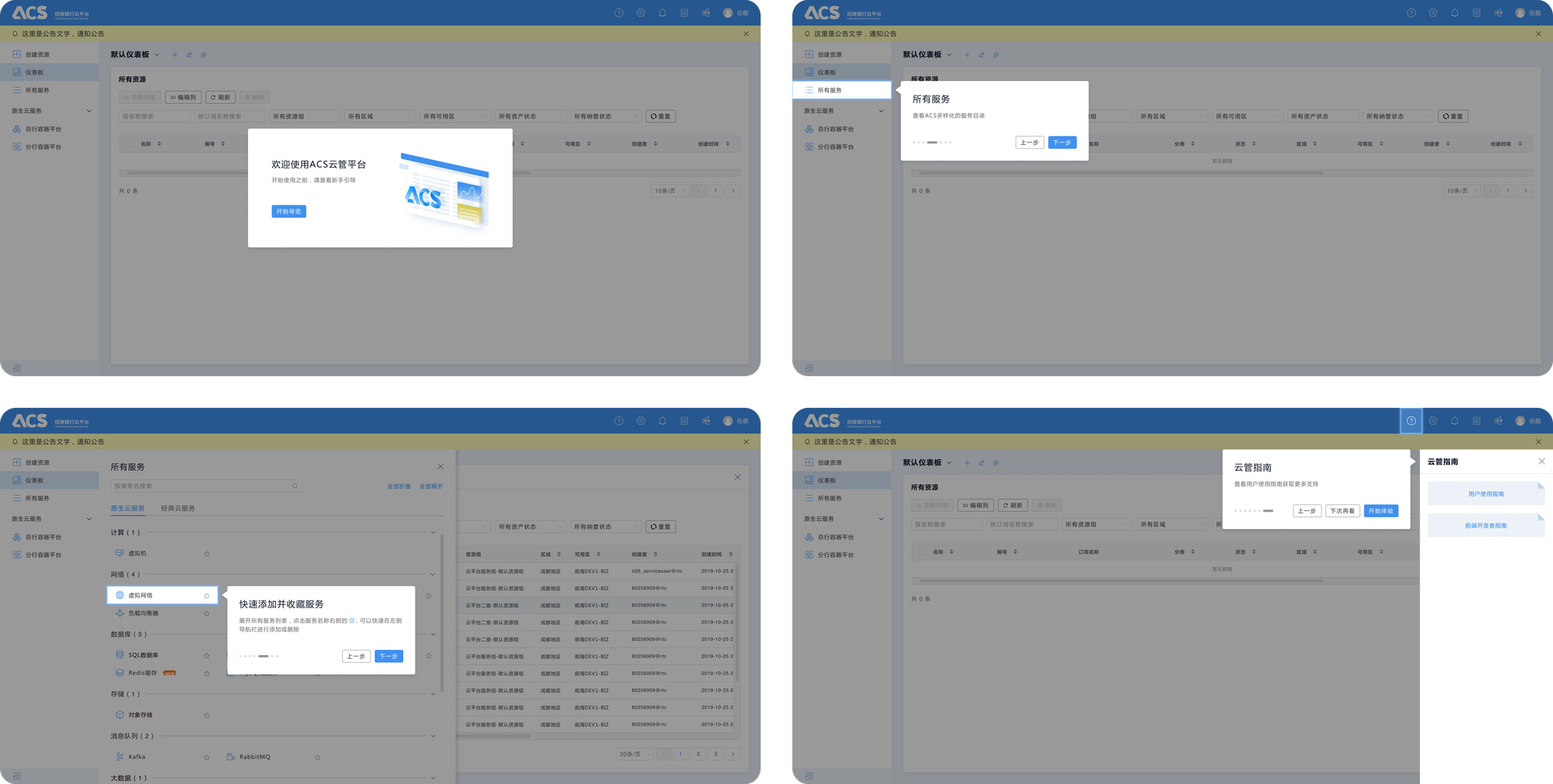
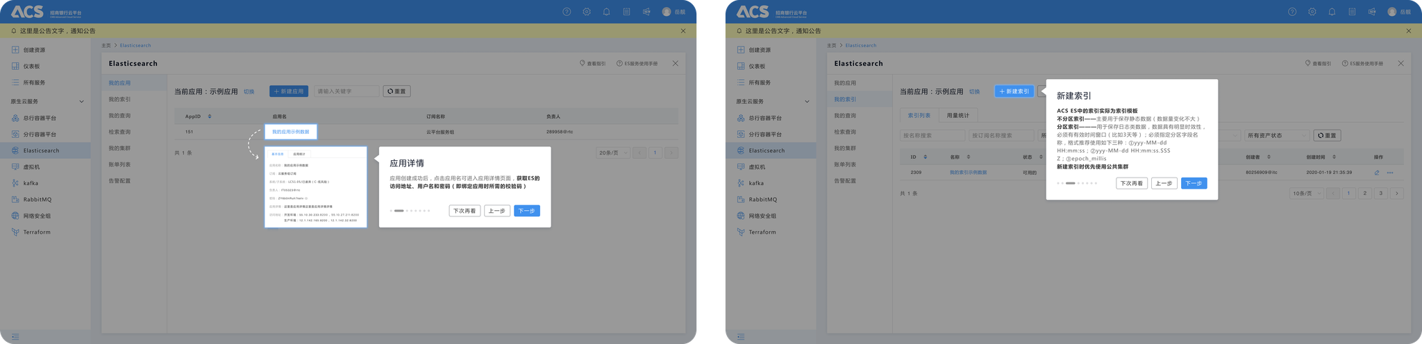
Three layers of progressive guidance
New and occasional users needed help, but permanent instructions would slow experienced operators and compete with dense operational data. I separated guidance into three layers based on when it is needed.
A short tour explains the overall dashboard, contextual tooltips introduce complex features on first use, and inline documentation supports task-specific questions without sending the operator away from the current workflow.
Craft
A dark mode designed for the night shift
Operators spend long hours in this product. The dark theme is a complete second skin, not a quick inversion. I tuned contrast ratios to WCAG, redefined semantic colours for alerts, statuses and data visualisations, and audited every component state across both themes.
Outcome
I delivered a coherent private-cloud console spanning the information architecture, operator workflows, interactive table patterns, progressive onboarding, and a shared light/dark component system. Together, these artifacts gave product and engineering one consistent foundation for extending complex operational workflows.
End of selected work